Author: Gwen Yun-Rong Phoo

  • Methods of Iterating

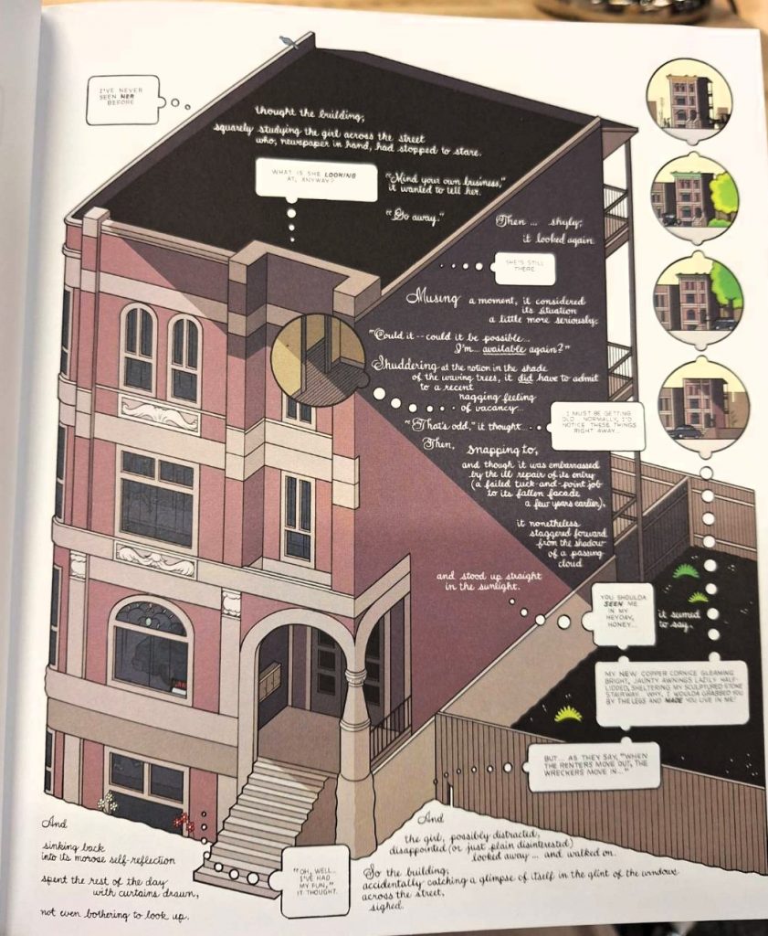
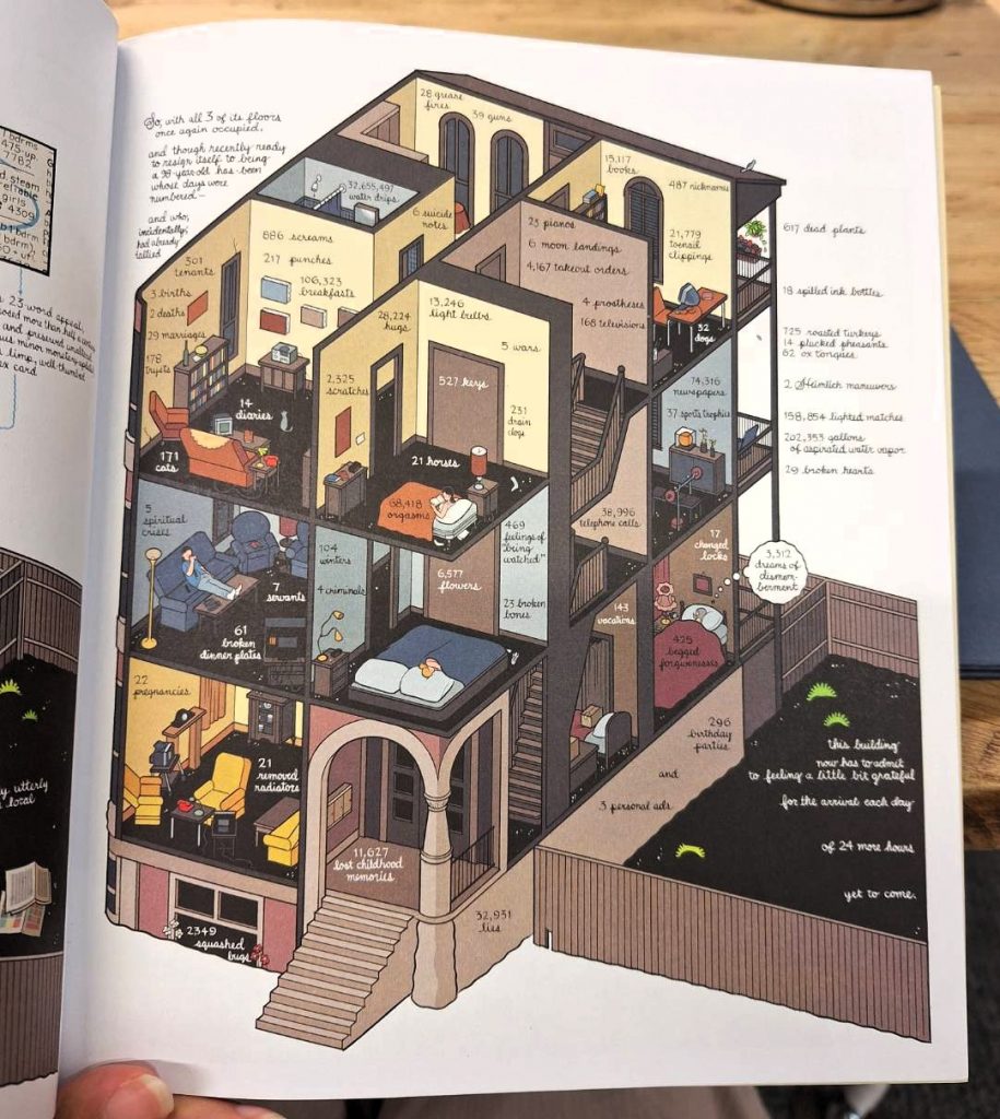
    Project: Coup De Vent by Alexis Jamet (Flip book Animation)

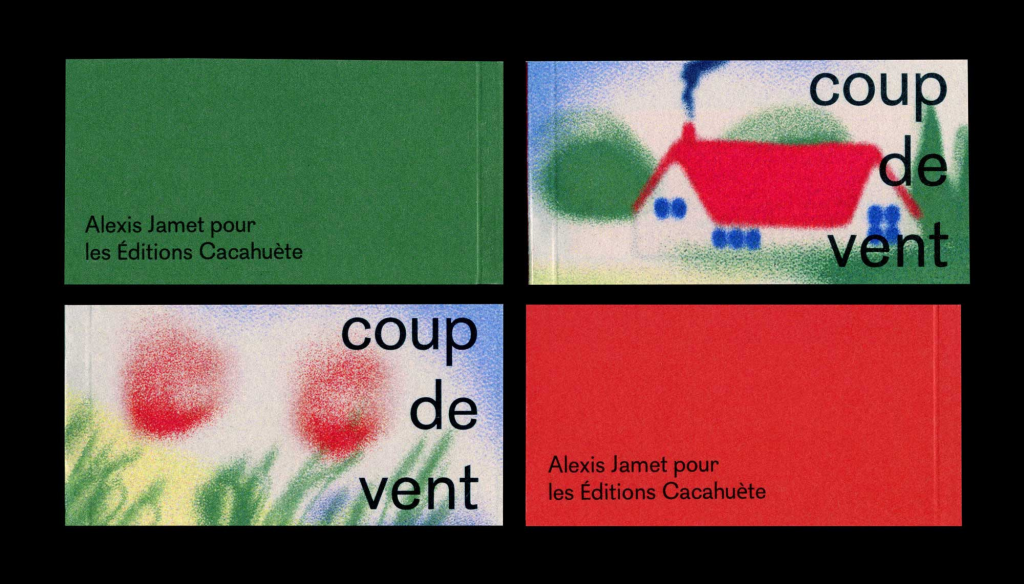
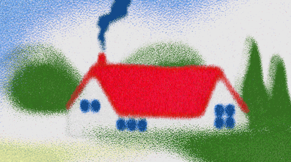
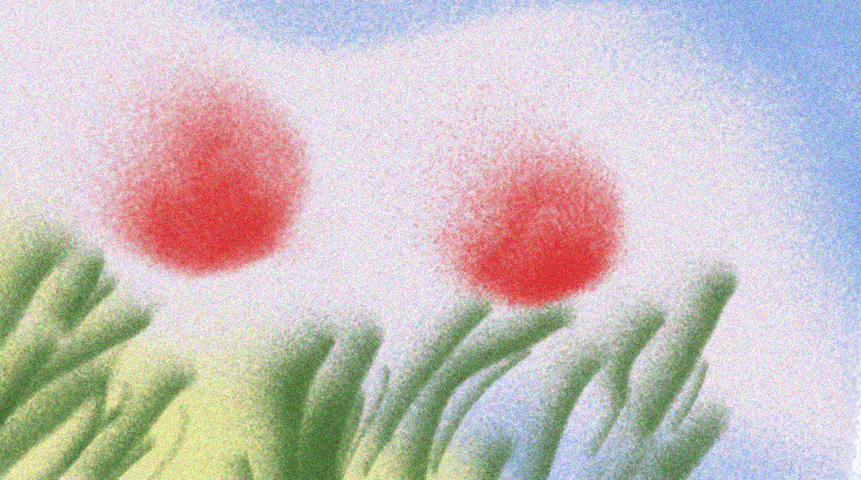
    “Coup De Vent” is a project containing two flip book animations, inspired by the English landscape of Letchworth Spencer Gore documented in 1912.

    Jamet, A., 2019. Coup De Vent. Illustration and graphic design. Available at: https://alecsi.com/Coup-De-Vent(Accessed: 20 January 2026).
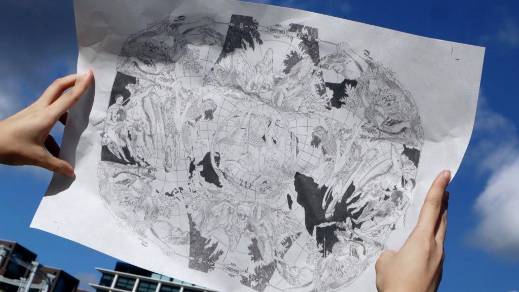
    Replicated Version

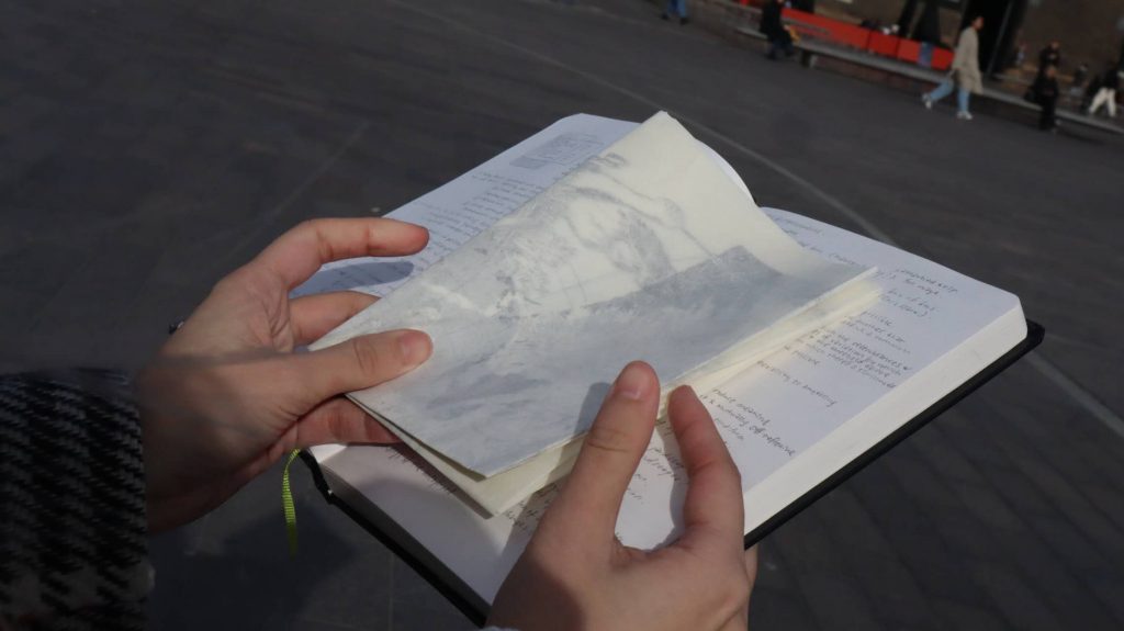
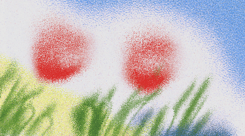
    Process: Illustrations on Photoshop. 10 frames for one sequence. (Shown below are two sequences for each animation.)

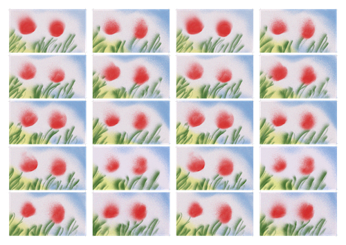
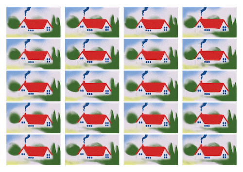
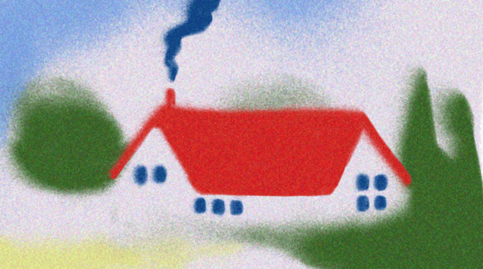
    ↑ Contact sheets (left: flowers; right: house) ↓ Animations in loop 
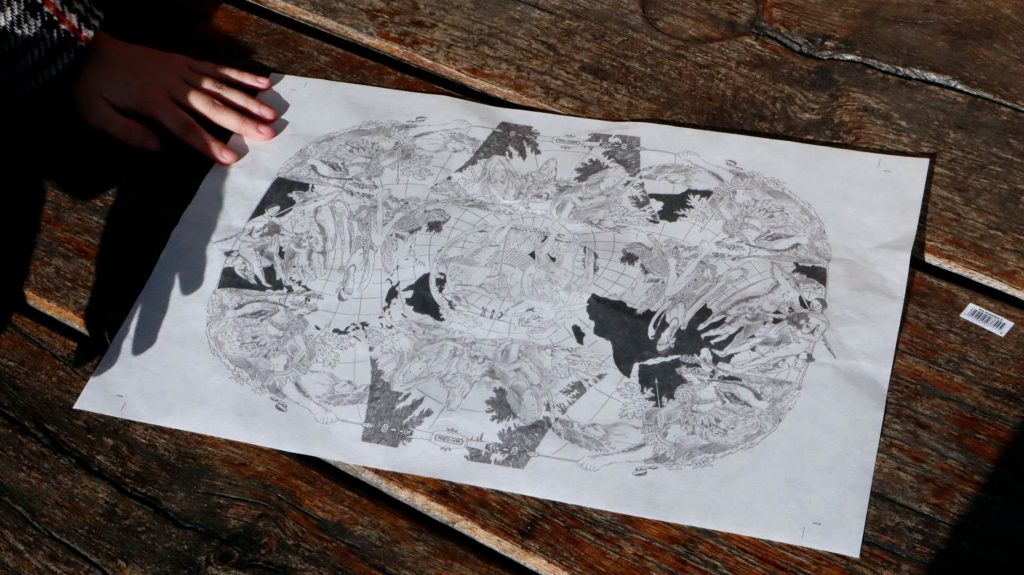
    ↓ Flip book

    Draft One

    Flip book animation is a traditional animation technique that has largely fallen out of use. The reasons for this obsolescence became apparent as I attempted the replication. The process can be divided into three stages: illustration, animation, and book production. 

    During the illustration stage, I observed that Jamet’s visual language relies heavily on the airbrush tool. Unlike conventional brush tools, the airbrush allows low fidelity and resists sharp definition, limiting precise control over form. This reduced control pushes the imagery toward abstraction. However, conventional animation theory prioritises clarity, legibility, and controlled motion, where subtle and precise alterations between frames accumulate movement. This raises the question: Can animation that deliberately resists precision and embraces a loss of formal control function meaningfully outside established animation frameworks that privilege visual clarity for narrative legibility? Furthermore, will audiences still be able to perceive an intended narrative when animation leans toward abstraction? 

    The production of the flip book itself exposes further structural restrictions. Producing a 60-page flip book required three days and cost £12, resulting in less than three seconds of animation. The medium is therefore marked by financial and ecological inefficiencies, which helps explain its replacement by software-based animation. Digital software allows for far more efficient production and reproduction, enabling animations to circulate with greater cultural and economic value through computation and digital screens. Correspondingly, this shift has influenced the audience’s viewing habits as well as their cognitive and temporal experience of animated images. This leads to a second question: How does the replacement of flip book animation by digital software reflect shifting values of time, labour, and image consumption in graphic communication? 

    Proposal

    This project will develop an iterative experiment that progressively accentuates abstraction within animated illustrations produced using the airbrush tool. Through reduction of lines and shapes, the experiment will test whether narrative interpretation can persist as recognisable forms dissolve. The aim is to assess how far animation can depart from conventions of controlled motion and legibility before narrative meaning becomes ambiguous, altered, or unreadable. This enquiry positions graphic clarity as a variable and interrogates whether visual precision is a necessary condition for narrative comprehension. 

    Alongside this, the project will investigate how the material format of the flip book influences temporal perception and audience engagement. The same animated sequence will be reproduced across different scales/formats (e.g. newsprint, magazines, handbooks, or calendars), with each page corresponding to a single frame of animation. This experiment will examine how changes in size, material, and context can affect the duration, pace, and manner of audience interaction, and how they reflect broader conditions of image consumption. 

    Overall, the project seeks to hack the conventional function of flip book animation as a medium designed to deliver coherent and polished sequences across a condensed span of time. Instead, it proposes an alternative mode of animation that disrupts the legibility of visuals and destabilises the continuity of frames to embrace inaccuracy and inconsistency. 

    Draft Two

    Flip book animation is a medium that favours precision and sensitivity to process, in which a series of actions unfolds page by page through carefully illustrated sequences. Traditionally, graphics in flip book animation have been understood as predetermined variants that work together to serve a narrative outcome. But what occurs when such authorial control is constrained and visual explicitness is reduced? Through an iterative experiment that progressively accentuates visual abstraction within narratives, this project reimagines flip book animation as a medium that generates narrative, rather than merely serving it. 

    As Blauvelt et al. (2013) state, the value of a work lies in the method that creates it. In this project, the repetitive process of abstracting the animation reshapes the narrative contained within the work. As abstraction intensifies, narrative departs from the original authorial intention. Rather than being predetermined by authorship, narrative becomes an outcome that emerges from systematic distortions. In this context, abstraction extends beyond expressive chaos. Instead, it operates as a configuration that originates unique interpretive logic specific to each of its viewer. 

    The order, scale, and format in which the animated sequence is printed act as additional configurations that shape the audience’s subjective perception of the narrative. The destabilised continuity of frames and the inconsistency of visual forms directly affect the duration, pace and manner of interaction. Together, these factors reveal the influence of materiality over image consumption, and establishes a set of conditions from which the animation is encountered, processed, interpreted and absorbed over time. 

    By defining the style and material of the flip book animation, this project interrogates the presumption of scripted narratives in flip book animation and proposes an alternative form of the medium, one in which meaning becomes relational, and narrative is no longer guaranteed.   

    Reference 

    Blauvelt, A., Candy, L., Daanen, H., van der Velden, E. and Vinke, J. (2013) Conditional Design Workbook: A Manual for Designing with Conditions. Amsterdam: Valiz. 

  • Methods of Translating

    Material: Le Silence de la mer (The Silence of the Sea)

    Melville, J.-P. (1949) Le Silence de la mer [Film]. France: Melville Productions.

    *A story set in German-occupied France during World War II, centred on the claustrophobic relationship between a Frenchman, his niece, and a German lieutenant (Werner von Ebrennac) billeted in their house. The story is told from the perspective of the Frenchman, whose diary reflects Ebrennac’s personal epiphany as he comes to understand the human cost of war.

    As a wartime film, Le Silence de la mer fundamentally explores the idea of resistance beyond violence. The title itself is a metaphor for France’s passive resistance against foreign occupation, with silence as a weapon of defiance, and the sea representing the undercurrents of emotions and culture that persist despite oppression.

    Method One: Hybridising

    This method combines and reconfigures separate scenes from the film to create entirely new narratives by altering the context and roles of the three main characters.

    Collected scenes

    This approach employs varying approaches to generate the alternative story lines.

    1. Switching Roles

    In the first two images, the roles of the intruder and the intruded are reversed by modifying the execution notice—from “executing French civilians in light of the murder of a German soldier” to “executing German civilians in light of the murder of a French soldier.” Names of executed French individuals are replaced with a German equivalent.

    The third image transforms the Niece from a character who avoids confrontation with the German military and remains silent throughout the story into one who boldly confronts her enemy. Collectively, the images heighten the tension between opposing forces in war, blurring the boundaries between the personal and the political, and the victim and the perpetrator.

    2. Changing Context

    This approach diminishes the gravity of war by changing notable wartime scenes into ordinary, everyday settings. In the first image, the German soldiers, originally delivering a forced notice that the Frenchman’s home would be requisitioned for military use, are replaced with Ebrennac acting as a real estate agent. Similarly, the second image portrays Ebrennac as a French local, casually strolling through the city centre of Paris. The third image, which originally took place in a Nazi military office, replaces propaganda posters praising the Axis forces with movie posters. Collectively, these images strip away scenes of wartime severity, highlighting how the horrors of political turmoil can be obscured when reframed through banal imagery.

    Method Two: Juxtaposing

    This method extracts, overlaps, and intertwines a monologue with another dialogue (both from the film) to generate new interpretations of the original monologue.

    Original monologue

    Before travelling to Paris to attend a convention, which he believed was being held in preparation for the union of France and Germany, Ebrennac expresses his excitement about the cultural and spiritual “marriage” between the two nations. He sees this union as mutually beneficial: France would reclaim its freedom, while Germany would gain and absorb France’s rich history and culture. The French hosts, however, remain silent and mournful.

    Original dialogue

    During his visit to Paris, Ebrennac’s comrades mocked at his ideals of German’s occupation as a mission of cultural understanding and reciprocal union. They made it clear that their objective is not to protect or enlighten France, but to crush its spirit and assert dominance. They ridicule his attempts at empathy and accuse him of being naive, emphasising that their role is to subjugate, intimidate, and break the morale of the French people.

    Monologue+Dialogue

    By intertwining the two audio tracks, this method reconfigures Ebrennac’s originally well-intentioned monologue into a threatening notice, likely exposing how his message was interpreted by the French hosts.

    Method Three: Paraphrasing

    This method transforms and recomposes spoken words and environmental sounds into symbolic musical motifs. Throughout the film, music serves as a key tool for communication, helping to build emotional connections between the three main characters. Ebrennac introduces himself as a musician, having been fascinated by French music from a young age. The Frenchman also describes Ebrennac as a “cultured man,” which contrasts with their usual perception of an enemy. The niece, likewise, is a piano teacher. It was through music that both parties were able to set aside their political roles, allowing the French family to recognise Ebrennac as an ordinary individual caught in the circumstances of war beyond his own control, just like themselves.

    Using Ebrennac’s monologue as the source, I separated his speech from the background noise and music. I then imported these audio tracks individually into music software, which analysed and encoded the sounds as data with notes and rhythms according to my preferences, and exported them as MIDI files. These MIDI files were subsequently recomposed into digital music scores. Below is a new track of music generated based on the scores.

    *Strings: Originally background noises and musics / Piano: Originally Ebrennac

    Result

    At first glance, the resulting scores appear conventional and could be read and performed like standard musical notation. However, they are not conventionally musical. Instead of representing a melody, the notes and symbols capture the flow, accents, and emotional tone of Ebrennac’s words (piano), as well as the silence shared between the French hosts (strings).

    Feedback

    • Method Three demonstrates interesting process and produces compelling visuals, but how these gestures and visual outcomes respond to the brief is less clear.
    • Method one produces interesting narratives, especially the one changing posters. The subtle modifications to the original scenes enable new interpretations of the film and characters.
    • Possible further development:
      • Building on the images produced by Method One, consider re-sequencing them and creating an AI-generated video. This video would construct another narrative that shifts the focus from analysing the German soldier Ebrennac to “amplifying” the silent resistance of the French people.
    • Suggested References:
      • Marclay, C. (2010) The Clock [Video installation].
      • Farocki, H. (1995) Workers Leaving the Factory [Video]. Germany.

    Further development

    Following feedback from last week, I continued developing the third method — paraphrasing. One comment noted that while the process and resulting visuals were engaging, the translation of conceptual elements from the film were still unclear. To address this issue, my aim this week focuses music as a language of communication within the film.

    As mentioned above, music serves as a key tool for communication and emotional connections throughout the film. However, in response to the feedback, I am reinterpreting music’s role from an expression of friendliness and understanding to an expression of opposition and resistance. Drawing inspiration from Harun Farocki’s multi-channel video installations, I developed a concept involving two juxtaposed video projections:

    • One depicting the peaceful life of the French people as if the war had never occurred
    • The other showing the German occupation of Paris, illustrating the spread of control and its effects on the city

    Each video is accompanied by an original musical composition constructed from sounds and narrations sourced from the film. In the video representing the French people, the music is composed using sounds and narrations from the French characters, which reflects their acts of resistance against the German occupation. The other vice versa. These video can be played individually as separate works, but when they are played simultaneously, the musics intertwines and combine into one. The idea is to employ irony and translate music from what is traditionally a bridge between individuals, to the site of conflict where two opposing messages converge.

    Reference

    Methodology

    To achieve this translation, I:

    1. Divided the film into two narrative perspectives: French civilians and German occupiers. Each perspective contains, correspondingly, scenes depicting ordinary French life and those containing prominent symbols of the war and the Nazis.
    2. Extracted the audio from these scenes, isolating narrations/monologues/dialogues (if any) from the background music and environmental sounds.
    3. Converted each audio elements into MIDI files.
    4. Construct new melodies by: reordering and layering the MIDI files; adding instrumental effects and manipulating the volumes of existing notes (and deleting notes that are out of tune/sync, but I try to keep the files as original as possible)

    Work In Progress

    Version 1.0: For this version, I focused on constructing one melody to serve as the main focus across both tracks to ensure cohesion. As this version primarily used audio from the Pro-German narrative, you may notice that portions of it appear in the final Pro-German channel as well. Due to their jittering patterns, most narrations were used as bass and strings to create depth instead.

    Version 2.0: I introduced audio from the Pro-French narrative on top of the previous version. Compared to the audio extracted from the Pro-German narrative, most Pro-French audio tend to be softer and less abrupt. In response, I attempted to construct an additional melody to complement the existing one. You may notice some obvious, repetitive piano sounds at the start of this version; these were intended to use the Pro-French narrations as a melodic element instead of rhythmic.

    Version 3.0: I experimented further with the instruments to make the repetitive piano notes more expressive, which you may notice as soft bar chimes at the start of the audio. This version also attempted to offset the two melodies, as I had difficulty finding a suitable timing for overlapping them. I was overly conscious of creating two independent melodies and neglected the fact that, while expressive in their own ways, they also needed to interact cohesively. Therefore, as you can see from the structure below, the Pro-German channel track appears almost empty at the start, and vice versa for the Pro-French channel. This was concerning because it meant that much of the Pro-German channel would be silent at the beginning, while the Pro-French channel would be silent at the end, which diverged from the original intention of creating two music tracks that “talk” to each other.

    Version 4.0: This version introduced more Pro-French narrative audio to explore potential compositions. In response to the issue mentioned earlier, I attempted to distribute the audio more evenly across the duration so that the two tracks would be balanced throughout the video.

    Version 5.0: This version is very close to the final version used in the two-channel video. I divided parts of the previous audio elements into smaller segments and refined certain notes in the Pro-French track to ensure clarity and prevent disruption with the Pro-German track.


    Outcome

    The first outcome is two interdependent musical pieces as shown below (p.1-2:Pro- French narrative; p.3-5: Pro-German narrative). Rather than displaying instruments as separate staffs in the score, I combined all instruments into one staff. In this sense, the notes themselves become symbols of unity — where multiple voices and narratives merge to express one collective message, or one melody.

    The second outcome is a two-channel video, as shown below.

    The two-channel video produces a paradoxical harmony: what appears to be a unified piece of work is, in fact, containing and composed from opposing political messages. The synchronisation and juxtaposition of scenes with similar settings uses graphics to establish a shared, observable environment for the two soundtracks to coexist. The overall outcome transforms music from an emotional language of connection (as originally framed in the film) into one that exposes contradictions, while echoing the metaphorical silence in the film’s title, where unspoken resistance and invasion coexist beneath the obvious surface of the images.

    In conclusion, this project reconfigures the focus of the film from a story of personal epiphany to a narrative of patriotism and national devotion.It magnifies the overlooked perspective of the French people, who kept silent throughout the film, and prompts reflection on the flexibility of graphic communication design in supporting, challenging or establishing moral standpoints of familiar histories.


    Written Response

  • Methods of Cataloguing

    Collection: Early maps to 1800

    CURIOSity Digital Collections. (2024). Scanned Maps. [online] Available at: https://curiosity.lib.harvard.edu/scanned-maps [Accessed 23 Oct. 2025].

    Method One: Sequencing

    The maps were reorganised along a spectrum from abstract/decorative to scientific/realistic. This method differentiates the maps according to their projections, content and function.

    Definitions:

    • Abstract/Decorative: maps with symbolic meanings, or mythological topics
    • Scientific/Realistic: maps reflecting modern ideas of scales and objectivity; in similar appearance to the popular map projections we see today

    The first row features celestial maps and those that include illustrations with inaccurate perspectives and minimal information about terrestrial landscapes. The second row presents maps in which the continents begin to take on shapes we’re familiar today, yet they remain adorned with mythological figures and creatures (e.g. personifications of natural forces on the corners, aka anthropomorphic figures). The last row consists of maps that demonstrate a more systematic representation of spatial relationships, emphasising the relativity of positions and scale (e.g. use of latitude & longitude). In general, sequencing the maps in this way reveals the historical shift of map-making.

    Method Two: (Re)Illustrating

    Each map was evaluated to identify symmetrical shapes, which were then re-illustrated using basic geometric forms such as circles, rectangles, and lines. In the GIF below, I developed an “equation language” to demonstrate the working process. This visual language illustrates how complex forms are constructed through the combination of simple shapes. Reillustrating the maps in this way highlights the structural connections between map projections, revealing how maps function as visual entities operating within a shared grammatical system.

    Method Three: (Re)Contextualising

    This method zooms in on the human figures (anthropomorphic figures) on the maps (whether mythical, allegorical, or real) to analyse their purposes and meanings. Below is a database of the collected figures.

    Based on the database, I created the following diptych:

    This diptych is dividing the database into two categories: the subjugated and the dominant.

    Figures categorised as the dominant depict Europeans as well-dressed, armoured, and civilised beings. Mythological figures are employed to enhance their status, including Fortuna (goddess of fortune and luck), Poseidon (associated with masculinity, aggressiveness, and power), Athena (goddess of wisdom and warfare), and Mars (god of courage and war). These figures emphasise Europe’s military strength and technological advancement.

    On the other hand, figures categorised as the subjugated depict Non-Europeans (including Asians, Mexicans, Australians, Africans, and Americans) as savage and minimally dressed, often portrayed engaging in exotic behaviours such as riding animals. In the map of the State of Georgia (the fourth illustration from the top on the left), the depicted individual, presumably enslaved, is shown working on plantations in an organised, clean and peaceful environment. In this map, the cartographer deliberately omits the brutal realities of slavery, especially those involving forced labour, physical punishment, and the violation of human rights.

    Recontextualising maps in this way is recognising maps as communicative devices that imperial powers have exploited to suppress and exaggerate information in order to assert dominance and establish superiority. Maps function as propaganda, presenting distorted realities and conveying biased messages that favour the politically dominant while marginalising others. Cartography, similarly, becomes a visual language that reflects power dynamics, cultural hierarchies, and political motives.

    Feedback

    Sequencing: Reconsider layout as the current format makes the top-left map simultaneously scientific and decorative. Suggest changing to a linear format to better convey the intended approach.

    (Re)Illustrating: Consider using the drawn shapes to develop a new symmetrical shape.

    (Re)Contextualising: Consider ‘mapping out’ the distortion of information. Explore different types of map projections and develop an outcome that illustrates how each projection distorts our knowledge of the world.


    Further Development

    Building on Method Three: (Re)Contextualising, the second week’s work further investigates into the power structures embedded within cartographic representation. It is extending the inquiry of maps as propaganda and power by examining how mapping systems not only depict geographical information, but pervade biased opinion of global relationships through spatial distortion.

    While in the previous week, anthropomorphic figures were examined to visualise colonial hierarchies, this week’s development examines deeper into the structure of map projection as a presentation of ideological control.

    To move forward, I selected the Mercator projection as the conceptual and visual foundation for this exploration. The Mercator is one of the most widely recognised projection nowadays, with users spreading across popular platforms such as Google Maps and OpenStreetMap. Its design, although purposefully created for marine navigation, distorts landmasses by inflating areas near the poles and diminishing those near the equator. This systematic distortion of spatial scale reinforces a Eurocentric worldview, visually magnifying the prominence of Europe and North America while marginalising Africa, South America, Southeast Asia and other regions historically subjected to colonisation.

    The image below shows how the Mercator projection distorts landmasses (Jasondavies.com, 2019).

    Jasondavies.com. (2019). Map Projection Transitions. [online] Available at: https://www.jasondavies.com/maps/transition/.

    To further develop, I distorted the anthropomorphic figures previously categorised as subjugated, then inserted them into the Mercator grid according to its latitude and longitude structure. This approach attempts to draw parallel between geographic manipulation with ethnic falsification. By transforming the anthropomorphic figures into visual embodiments of spatial distortion, the resulting pattern recomposes the Mercator projection as a visual system structured to create ethnic falsification through territorial misrepresentation.

    From the previous step, I produced the following illustration. Composed mainly of the distorted figure, the illustration still preserved qualities distinct to the Mercator projection, e.g. the arrangement of coordinates and use of symmetry.:


    Outcome

    Conclusion

    The outcome is a visualisation of a critical reconstruction that exposes the ideological manipulation of cartography. Its accessible A3 print format mocks on the usual map presentation and invites critical engagement from the audience. In doing so, the project interrogates inherited perspectives on the overlooked narratives of social minorities, proposing an alternative mode of reading maps as critical devices. The graphics exaggerate the partiality of mapping systems, reframing them as propagandistic instrument that legitimise ethnic misrepresentation through geographical distortion. Through the integration of iconographic analysis and spatial critique, the resulting image emphasises how the geometric precision of maps can conceal deep ethnic-political biases. It is a symbolic expression of global inequality, revealing how visual rationality—such as map projection—is, in fact, subjective and perpetuates territorial and cultural hierarchies.

    Written Response

    *Best Viewed in Double-Page Format

  • Methods of Investigating

    Week 1

    To kick off the first brief, I selected London Bus Route 73 as my chosen physical site of investigation.

    The foundation of this first stage lies on the theory that buses, as a form of mobile infrastructure, function not only as a mode of transport but also densely packed conduits within the city’s sociological network.

    With this assumption in mind, I employed three methods of investigation to analyse Route 73 from three perspectives: who the service is designed for, who it actually serves in practice, and how commuters interact with both the space and one another during their journeys.

    Method One: Sketching

    This method focused on understanding who the bus service is designed for, through sketches of the exterior and interior of the physical site. These sketches served to define the space and establish the context in which observations for the subsequent methods would take place.

    Method Two: Notetaking

    This method focused on understanding who the bus actually serves in practice, through notetaking of conversations that took place within the site. These notes provided brief insights into the passengers’ backgrounds. Independent of visual presentation, the notes offered quick presumptions of the observees’ occupation and connections in society (the outside world, a.k.a. the city), and the role the bus plays in reinforcing those connections.

    Sept 23rd, 11:28
    Essex Road / Marquess Road
    Two female young adults
    Scenario: taking their seats
    A: “Tottenham Court Road?”
    B: “Yea.”
    Sept 24th, 13:20
    Angel station
    Three female teenagers (middle school students)
    Scenario: gossiping about a classmate
    A: “She told me, like, I don’t know, it wasn’t like that.”
    B: “No, but, but she told me...(unidentifiable)”
    C: “No way!”
    A: “She did not!”
    Sept 24th, 16:12
    Penton street
    Two female young adults
    Scenario: stuck at the bus entrance
    A: “There’s, like, space at the back... I don’t know why no one’s moving.”
    B: “Hm.”
    Sept 24th, 16:16
    Baron Street / chapel market
    Adult man
    Scenario: on the phone, possibly with a sibling
    Him: “Hello, how are you doing, mate?”
    Him: “Right, yea yea, sure.”
    Him: “I’ll probably give a call to Mum and Dad.”
    Him: “I’ll drive to your place later.”
    Him: “I can be there around 2 or 3 — whatever works.”
    Him: “Would you pay me?”
    Him: “Or I can beg them to drive me.”
    Sept 24th, 16:24
    Angel station
    Young boy (primary school student)
    Scenario: on the phone with his mum
    Boy: “Hello? Mum, I’m a bit late.”
    Boy: “Yea, um, like, Angel.”
    Boy: “Yea, okay. Okay. Bye.”
    Sept 24th, 16:29
    Newington green road/balls pond road
    Adult man
    Scenario: on the phone, possibly with their partner
    Him: “Hello, luv, I’ll be there before 5.”
    Him: “Yes, um, that’d be, that’d be great.”
    Him: “Yea, see you later. Bye, luv.”

    Method Three: Notetaking & Photographing

    This method focused on understanding how commuters interact with both the space and one another, through a combination of notetaking and photography of specific individuals (e.g. appearances, languages, seating positions, actions, gestures, etc.) These notes and photographs provided more detailed insights into the passengers’ backgrounds and allowed the observer to construct a more comprehensive and accurate profile of each observee, while also identifying which part of the social network this specific bus route contributes to.

    1. A man with headphones on, napping (September 23rd, 11:25AM, Green Lanes)

    A man got on the bus this morning between 11 and 11:30 a.m. He boarded before Green Lanes Shacklewell. He went upstairs and chose the front-left seat on the upper deck — first row, by the window. His backpack was placed on the aisle seat beside him.

    Sunlight was coming in from the right side of the bus. He sat on the left, possibly to avoid the sun. It wasn’t a particularly busy time. There were fewer than five people on the upper deck. [Pshht. Vrrrm. Clunk.]

    The man wore a dark blue hoodie and a pair of headphones in similar colour. He didn’t speak. He made no noticeable sound. He barely moved.

    [Deep hum.] The bus continued its journey via King’s Cross, and stopped at a red light on Capper Street. The man lifted his head, paused for two seconds and looked to his left. Still no words.

    Then, he turned his head to the right, lifted his right hand, and pressed the red button on the yellow handle beside him. He grabbed his backpack, walked swiftly down the stairs, and got off at Stephen Street.

    2. A middle-aged couple sitting next to each other (September 24th, 04:13PM, Pentonville Road / Baron Street)

    A couple sat on the second row of the upper deck, near the stairs. One of the closest rows to the exit. It was a clear afternoon. Bright sun, soft breeze, blue sky. The kind of weather perfect for outings.

    The bus stopped at Angel Station. The woman looked to her left. She appears to set her eyes on the shops along the street: Angel Central, VUE, Uniqlo, OFFICE, MONSOON, Accessorize, Pret, OASIS.

    She turned to her right and made a brief comment of her observation. The man slightly tilted his head first, then turn his head to respond. [Continuous thud. Soft rustle of fabric. Passengers alighting. Footsteps.] Their conversation was hard to make out over the background noise. The man subtly nodded, agreeing with her comment.

    The bus continued its journey. They didn’t speak again. The woman continued looking out the window. The man did the same, occasionally.

    [Ding.] Another passenger rang the bell before the bus reached Ockendon Road. The man stood up, with a plastic grocery bag in his right hand. He looked at the woman. She shifted sideways, toward the aisle. He moved out to the aisle and walked toward the stairs. She followed. They walked down the stairs slowly and alighted.

    3. Three women sitting at the front seats, chatting (September 26th, 10:54AM, Green Lanes)

    10:54 a.m.: I walked toward the upper deck. Three women occupied the very front of the upper deck. Two appeared middle-aged, the third in her twenties. The older two sat side by side; the younger woman sat directly across the aisle, apart, but definitely part of the group.

    By the similarity in their features and the ease of their rapport, I reasonably guess: daughter, mother, aunt.

    They were chatting. The daughter, if such she was, carried the early lead in the conversation. Their language was foreign, likely Italian. The younger woman smiled as she spoke, rotating herself nearly ninety degrees to face her (presumed) mother. She spoke with enthusiasm; the older women responded in kind tone and gesture—soft words, bodies leaning inward, eyes attentive.

    11:03 a.m.: The bus reached Cross Street. The older women now leads the conversation. The one near the aisle said something, the other responded with clear laughters, “Ha! Ha! Ha!”. Their conversation continued without pause but stayed within the boundaries of social propriety.

    11:25 a.m.: The bus reached King’s Cross Station. Their conversation carried on. I alighted.

    Tutorial Feedback + Reflection

    Since texts played a major role in my initial methods of investigation, the group suggested exploring further into the visual translation of textual elements. A potential direction could be to personify the texts to embody the tone expressed through the expressed conversations, illustrating how these invisible and overlooked conversations themselves interact with the setting in our everyday life.

    Recommended References:

    • Ware C., Ware C. and Ware M. (2012). Building stories. London: Jonathan Cape
    • ASCII art

    Week 2

    Researched References

    Greener Journeys (2016) The value of the bus to society. Available at: https://www.cpt-uk.org/media/2q1ku1ou/the-value-of-the-bus-to-society-final.pdf (Accessed: 30 September 2025).

    Transport for London (2025) The benefits of buses in London: A summary of evidence, The social, health and economic benefits of buses in London. Available at: https://content.tfl.gov.uk/the-economic-and-social-benefits-of-buses.pdf (Accessed: 03 October 2025).

    Building Stories, Chris Ware

    This reference was particularly relevant to my further investigation as it proposed a non-linear storytelling technique. It played around with different forms of comic, appearing as separate prints while responding to the same narrative within the same setting. The pieces can be individually read in any order, and the narrative continually rewrite itself as the reader begins a new piece of print.

    Ware, C. (2012). Building stories. London: Jonathan Cape.

    Visual Responses

    1. This response attempts to imitate the diagrammatic format of comic form as presented in Buildling Stories (Ware, 2012). It visualises the key elements that defines the travelling experience and those experiencing it through icons and category of colours.

    2. This response attempts to take a more narrative-driven approach. The first image presents a set of alphabets personified in varying gestures and characters. The second image positions these personified alphabetical characters into the bus setting. This response aims to emphasise how languages flow within and fills up the space the conversations are taking place.


    Week 3

    Building upon the second visual response developed last week (the comic), conversations between passengers continue to serve as the primary focus of my investigation. My focus this week is to identify the correspondence of verbal communication and the bus as mediums that facilitate connections within the city’s broader social network. I explore into the context and motivations behind conversations engaged during the journeys. Upon reviewing the previous notes, I noticed how such interactions are typically short and casual. They often revolve around daily schedules, quick updates about mutual connections, or spontaneous comments on the physical surroundings (inside/outside the bus).

    At the beginning of this project, I wanted to explore bus as a social setting assuming that new connections would naturally form between strangers whose journeys overlap due to spatial constraints. I initially believed that these incidental interactions could extend into the city’s broader social network. But, in observations, commuters are highly conscious of their personal space and tend to avoid intruding on others’ too. Rather than forming new connections with unfamiliar passengers, people tend to use the bus as a setting to reinforce existing social bonds with those they are familiar and travelling with. From this perspective, I began to understand that conversation is a type of interaction that commuters have been forced to adopt, in order to retain private space within the public setting. Hence, the content and emotion of these conversations tend to remain private, shared only between those actively engaged in the interaction.

    Reflecting on the visual response produced last week with this notion in mind, I found the illustrations too subjective. The characters, for instance, were illustrated with a lot of my own interpretation and imagination during the process. The background and passengers were relatively more objective since they were created based on what I visually observed.

    A few feedback I found particularly useful during this process: 1) the concept of an alphabet flip book; 2) a multi-layered print that gradually reveals more about each passenger as layers are opened; 3) and the use of speech bubbles to direct attention to the conversations rather than the individuals themselves. I was aiming to find an alternative that could visually recreate the conversation while keeping it’s authenticity.

    Researched References

    Metamorphosis, Tor Weibull

    This publication is a recreation of Franz Kafka’s Metamorphosis designed to inform the relationships between the main characters through the relative positions of paragraphs and texts throughout the pages. It’s an interesting demonstration of the capacity of format to produce relative meanings between the given texts, as well as the capability of text as a structural form of graphics.

    Weibull, T. (2015). Metamorphosis. [Print on Paper].

    Visual Responses

    Written Response