Collection: Early maps to 1800
CURIOSity Digital Collections. (2024). Scanned Maps. [online] Available at: https://curiosity.lib.harvard.edu/scanned-maps [Accessed 23 Oct. 2025].
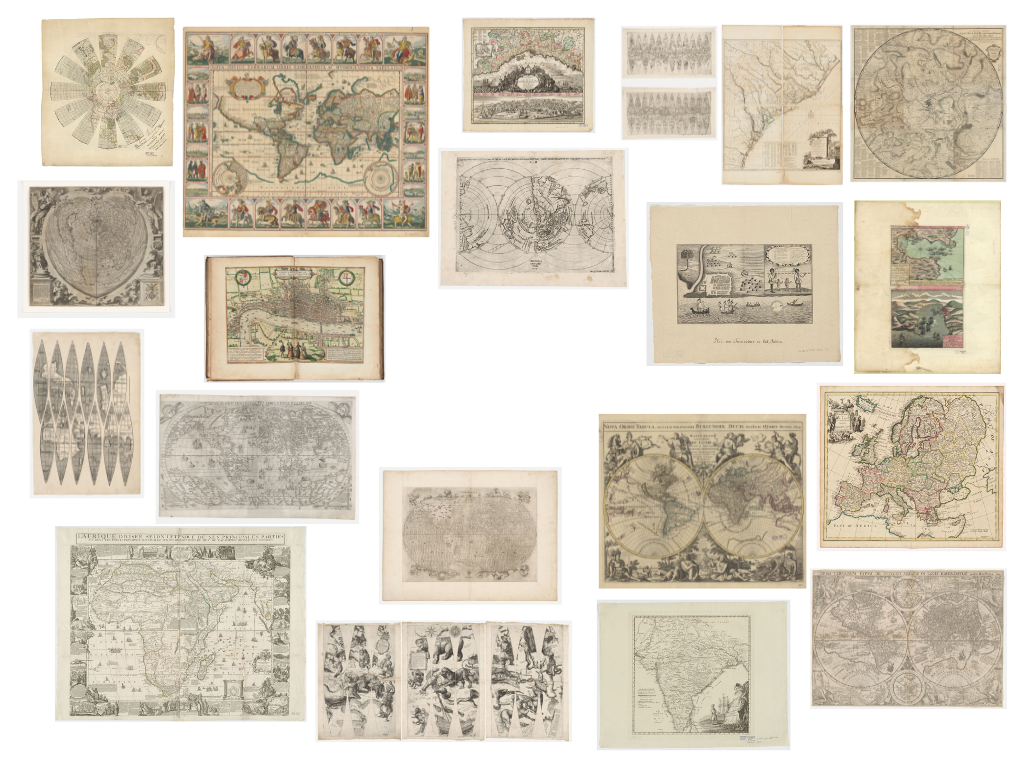
Method One: Sequencing
The maps were reorganised along a spectrum from abstract/decorative to scientific/realistic. This method differentiates the maps according to their projections, content and function.
Definitions:
- Abstract/Decorative: maps with symbolic meanings, or mythological topics
- Scientific/Realistic: maps reflecting modern ideas of scales and objectivity; in similar appearance to the popular map projections we see today
The first row features celestial maps and those that include illustrations with inaccurate perspectives and minimal information about terrestrial landscapes. The second row presents maps in which the continents begin to take on shapes we’re familiar today, yet they remain adorned with mythological figures and creatures (e.g. personifications of natural forces on the corners, aka anthropomorphic figures). The last row consists of maps that demonstrate a more systematic representation of spatial relationships, emphasising the relativity of positions and scale (e.g. use of latitude & longitude). In general, sequencing the maps in this way reveals the historical shift of map-making.
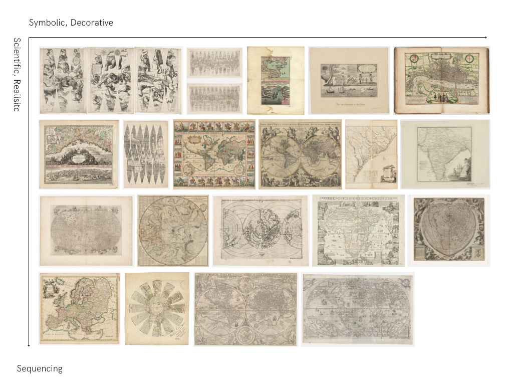
Method Two: (Re)Illustrating
Each map was evaluated to identify symmetrical shapes, which were then re-illustrated using basic geometric forms such as circles, rectangles, and lines. In the GIF below, I developed an “equation language” to demonstrate the working process. This visual language illustrates how complex forms are constructed through the combination of simple shapes. Reillustrating the maps in this way highlights the structural connections between map projections, revealing how maps function as visual entities operating within a shared grammatical system.

Method Three: (Re)Contextualising
This method zooms in on the human figures (anthropomorphic figures) on the maps (whether mythical, allegorical, or real) to analyse their purposes and meanings. Below is a database of the collected figures.

Based on the database, I created the following diptych:
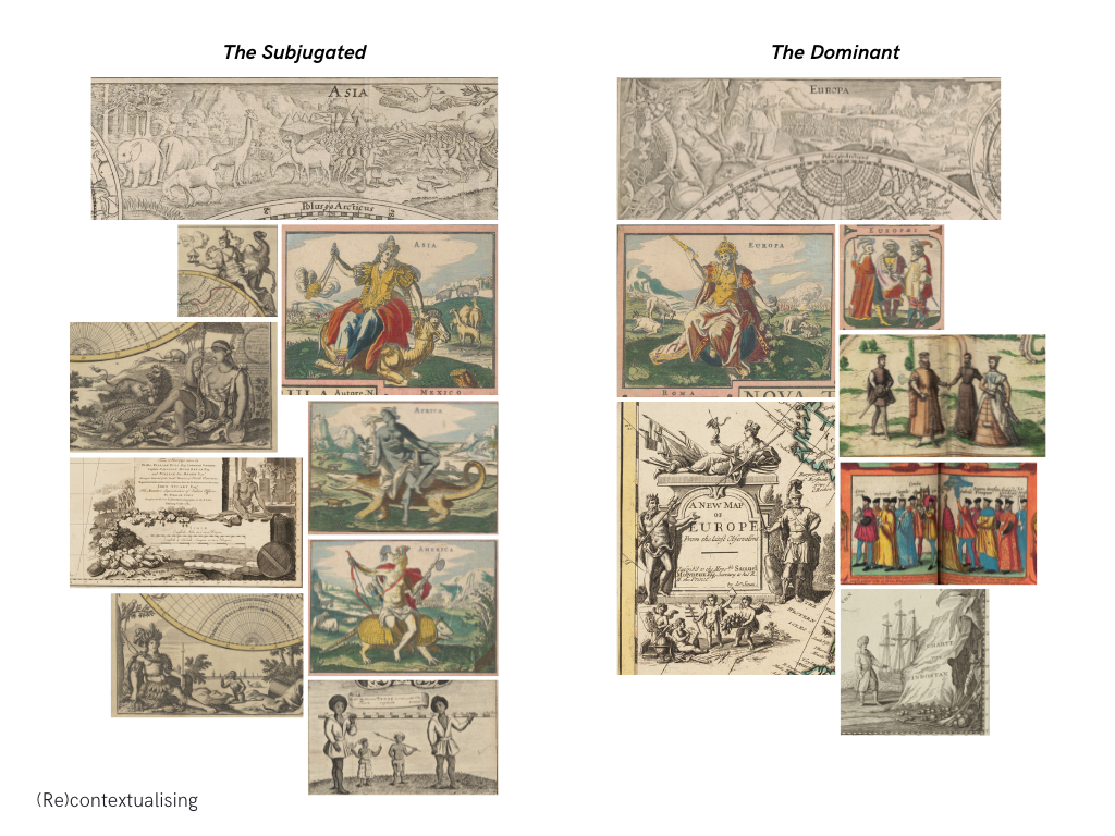
This diptych is dividing the database into two categories: the subjugated and the dominant.
Figures categorised as the dominant depict Europeans as well-dressed, armoured, and civilised beings. Mythological figures are employed to enhance their status, including Fortuna (goddess of fortune and luck), Poseidon (associated with masculinity, aggressiveness, and power), Athena (goddess of wisdom and warfare), and Mars (god of courage and war). These figures emphasise Europe’s military strength and technological advancement.
On the other hand, figures categorised as the subjugated depict Non-Europeans (including Asians, Mexicans, Australians, Africans, and Americans) as savage and minimally dressed, often portrayed engaging in exotic behaviours such as riding animals. In the map of the State of Georgia (the fourth illustration from the top on the left), the depicted individual, presumably enslaved, is shown working on plantations in an organised, clean and peaceful environment. In this map, the cartographer deliberately omits the brutal realities of slavery, especially those involving forced labour, physical punishment, and the violation of human rights.
Recontextualising maps in this way is recognising maps as communicative devices that imperial powers have exploited to suppress and exaggerate information in order to assert dominance and establish superiority. Maps function as propaganda, presenting distorted realities and conveying biased messages that favour the politically dominant while marginalising others. Cartography, similarly, becomes a visual language that reflects power dynamics, cultural hierarchies, and political motives.
Feedback
Sequencing: Reconsider layout as the current format makes the top-left map simultaneously scientific and decorative. Suggest changing to a linear format to better convey the intended approach.
(Re)Illustrating: Consider using the drawn shapes to develop a new symmetrical shape.
(Re)Contextualising: Consider ‘mapping out’ the distortion of information. Explore different types of map projections and develop an outcome that illustrates how each projection distorts our knowledge of the world.
Further Development
Building on Method Three: (Re)Contextualising, the second week’s work further investigates into the power structures embedded within cartographic representation. It is extending the inquiry of maps as propaganda and power by examining how mapping systems not only depict geographical information, but pervade biased opinion of global relationships through spatial distortion.
While in the previous week, anthropomorphic figures were examined to visualise colonial hierarchies, this week’s development examines deeper into the structure of map projection as a presentation of ideological control.
To move forward, I selected the Mercator projection as the conceptual and visual foundation for this exploration. The Mercator is one of the most widely recognised projection nowadays, with users spreading across popular platforms such as Google Maps and OpenStreetMap. Its design, although purposefully created for marine navigation, distorts landmasses by inflating areas near the poles and diminishing those near the equator. This systematic distortion of spatial scale reinforces a Eurocentric worldview, visually magnifying the prominence of Europe and North America while marginalising Africa, South America, Southeast Asia and other regions historically subjected to colonisation.
The image below shows how the Mercator projection distorts landmasses (Jasondavies.com, 2019).
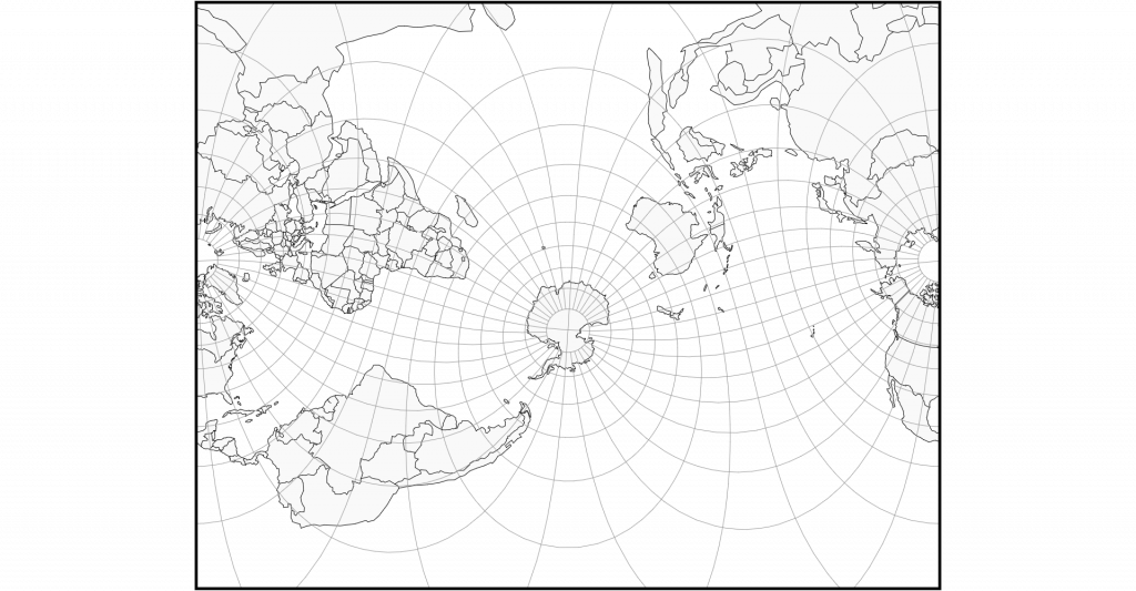
Jasondavies.com. (2019). Map Projection Transitions. [online] Available at: https://www.jasondavies.com/maps/transition/.
To further develop, I distorted the anthropomorphic figures previously categorised as subjugated, then inserted them into the Mercator grid according to its latitude and longitude structure. This approach attempts to draw parallel between geographic manipulation with ethnic falsification. By transforming the anthropomorphic figures into visual embodiments of spatial distortion, the resulting pattern recomposes the Mercator projection as a visual system structured to create ethnic falsification through territorial misrepresentation.

From the previous step, I produced the following illustration:
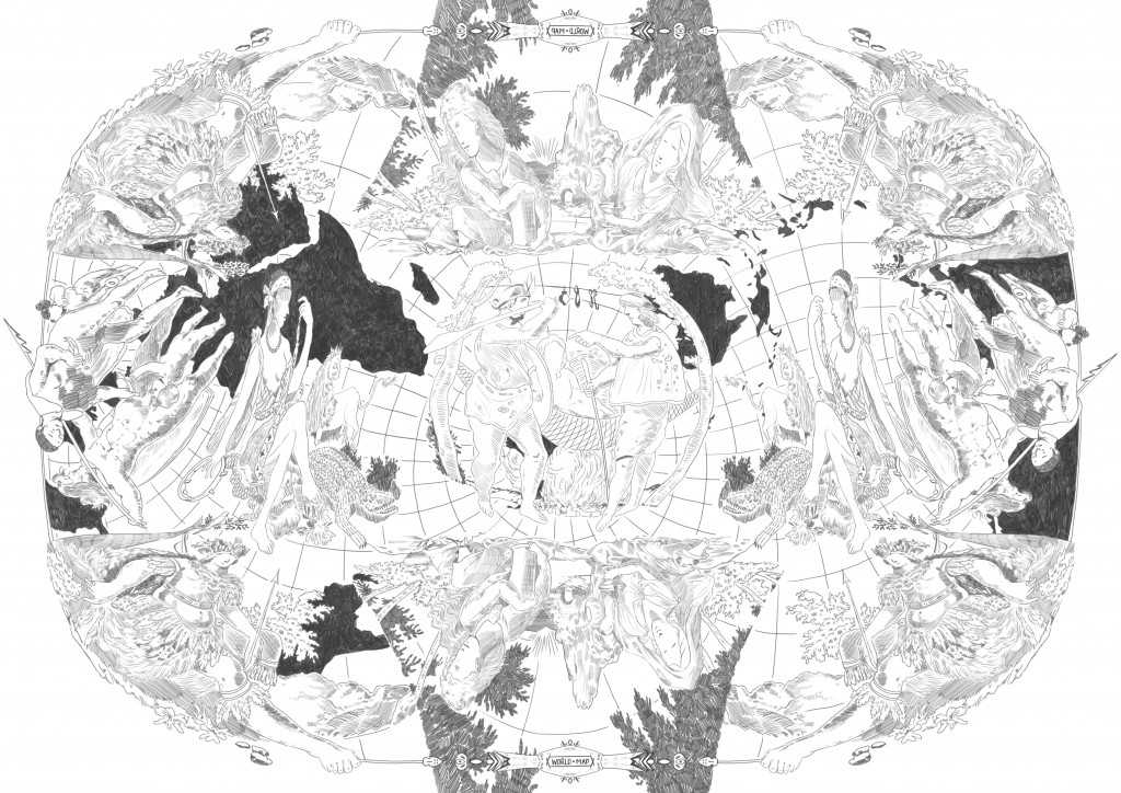
Final Outcome
The outcome is a visualisation of a critical reconstruction that exposes the ideological manipulation of cartography. It interrogates the neutrality of mapping systems, reframing them as propagandistic device that legitimise ethnic misrepresentation through geographical distortion. Through the integration of iconographic analysis and spatial critique, the resulting image emphasises how the geometric precision of maps can conceal deep ethnic-political biases. It is a symbolic expression of global inequality, revealing how visual rationality —such as map projection—is, in fact, subjective and perpetuates territorial and cultural hierarchies.